Carousel Slider
Carousel Slider is an awesome extension that lets you create a highly customizable, stylish responsive carousel slider. Here, with our Image Hover Effects Ultimate plugin, you can have this effective extension fully free with the bundle. Now, let’s see how to use this extension and embed Carousel Slider within your pages:
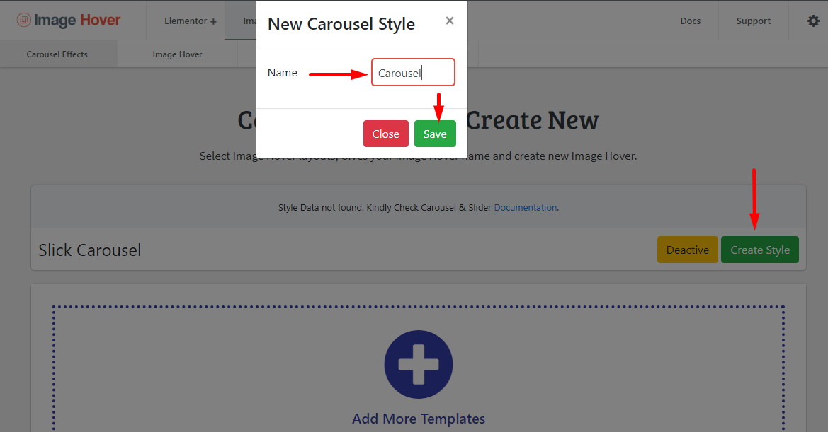
Creating a New Carousel Slider
First, navigate Image Hover> Image Hover> Extension> Carousel Slider from your dashboard.
Then, create a new Carousel Style by clicking on the Create Style button like below
Customizing & Adding Data
Now, after you create a new Carousel Slider it’s time to go further and add/style data to your extensions. Let’s start this section:
General Settings
ΞCarousel Query- Here in this section, you can define the primary query of your Carousel Slider.
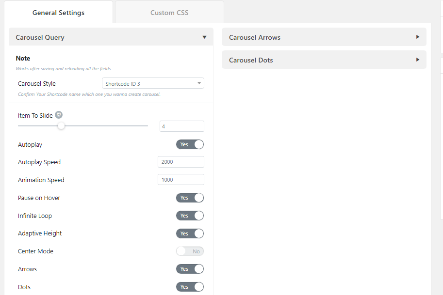
⇒Carousel Style: You can add an image effect on the carousel slider by selecting a Shortcode here. Confirm Your Shortcode name which one you wanna create a carousel here.
Note: If you want to customize the style effects of the carousel, then kindly go to the associated effects page and perform the edits. The style effects of the Carousel Slider will also change after saving & reloading the page.
⇒Item to Slide: You can restrict items per slide to display a specific number of slides on a single carousel. It takes a numeric value which signifies the number of items to be displayed at a time.
⇒Autoplay: Enable/disable the Autoplay of the carousel.
⇒Autoplay Speed (ms): Set the Autoplay speed in the carousel based on ms.
⇒Animation Speed (ms): Set the Animation speed in the carousel based on ms.
⇒Pause On Hover: Want to pause your carousel on hover? Enable/disable it here.
⇒Infinite Loop: Enable/disable the infinite loop to the carousel.
⇒Adaptive Height: Set the adaptive height to the carousel.
⇒Center Mode: Enable/disable the center mode of the carousel slider.
⇒Arrows: Enable arrows as the navigation in the carousel slider.
⇒Dots: Enable dots as the pagination in the carousel slider.
ΞCarousel Arrows- And this section is for customizing the carousel arrows for the carousel slider.
⇒Choose Arrow: Add icon to the carousel arrow for both the left and right arrow.
⇒Size: Manually customize the size of the arrows for different dimensions.
⇒Position X: Set the arrow icon position for the X-axis in different dimensions.
⇒Position Y: Set the arrow icon position for the Y-axis in different dimensions.
⇒Color: Add a custom color to the carousel arrow in the carousel slider for both normal and hover view.
⇒Background Color: Add a custom background color to the navigator arrows for both normal and hover. Know more about Background Color.
⇒Border Type: Here, select a border type from the list according to your preference. And then set the border width for the top, right, bottom and left of the navigator arrow for different dimensions. You can link the values together or customize them individually.
⇒Border Color: Add a custom color to the border for both normal and hover view.
⇒Box Shadow: Customize the box-shadow color, set the horizontal and vertical value of the shadow, control the blur radius and spreading, and set the position either outline or inset. Know more about Box-Shadow.
⇒Border Radius: Set the border-radius around the arrow for different dimensions.
⇒Padding: Set the padding value for the top, right, bottom and left around the arrow for different dimensions. You can link the values together or customize them individually.
ΞCarousel Dots- This section is for customizing the carousel dots for the carousel slider.
⇒Size: Manually customize the size of the carousel dots for different dimensions.
⇒Width & Height: Manually customize the width & height of the carousel dots for different dimensions.
⇒Position Y: Set the carousel dots position for the Y-axis in different dimensions.
⇒Spacing: Add a custom space to the carousel dot.
⇒Color: Add a custom color to the carousel dots in the carousel slider for normal, hover, and active view.
⇒Background Color: Add a custom background color to the carousel dots for normal, hover and active view. Know more about Background Color.
⇒Border Type: Here, select a border type from the list according to your preference. And then set the border width for the top, right, bottom and left of the carousel dot for different dimensions. You can link the values together or customize them individually.
⇒Border Color: Add a custom color to the border.
⇒Border Radius: Set the border-radius around the dots for different dimensions.
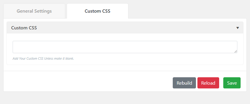
Custom CSS
Here you’ll find a box where you can add your custom CSS code. Advanced developers can use this option for their convenience. After entering the codes, developers can see the live preview by reloading the page.
Once you finish coding hit the “Save” button to make your changes.
Now, just Copy the Shortcode and Paste anywhere in the post or page or plugins where you want to show the Carousel Slider.