After confirming the layout, you can finally start editing your image hover item. You can add your own images if you want to, or use our pre-built layout. It’s up to you!
Here in this tutorial, you’re going to learn how to edit a pre-built layout and customize it in your own way. So let’s get started:
Edit the Image
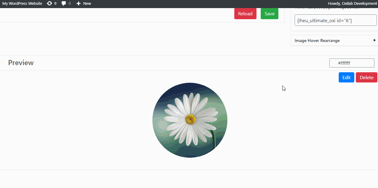
After selecting a layout and creating an image hover effect item, you can see the live preview at the bottom side of the editor page. When you hover over the image you’ll find an edit icon in the image. See the image below,
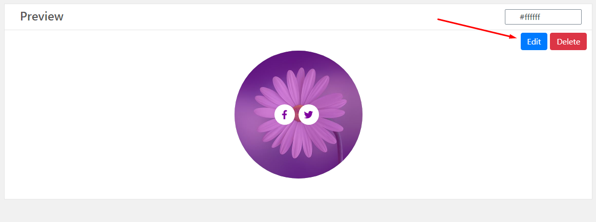
By selecting the Edit icon, you’ll find the image hover modification form. Here you can customize the image.
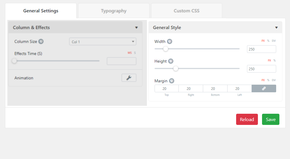
General Settings
After adding and customizing an image successfully here you can find the “General Settings” section along with 2 sub-sections. Now, let’s see how to edit this section:
Column & Effects
Here in this sub-section, you can customize the column size, effects time, and animation.
In the animation settings, you’ll find 5 different options. By using these options, you can select the animation type, set the duration and delay time, customize the offset, and enable/disable the looping of the animation transition.
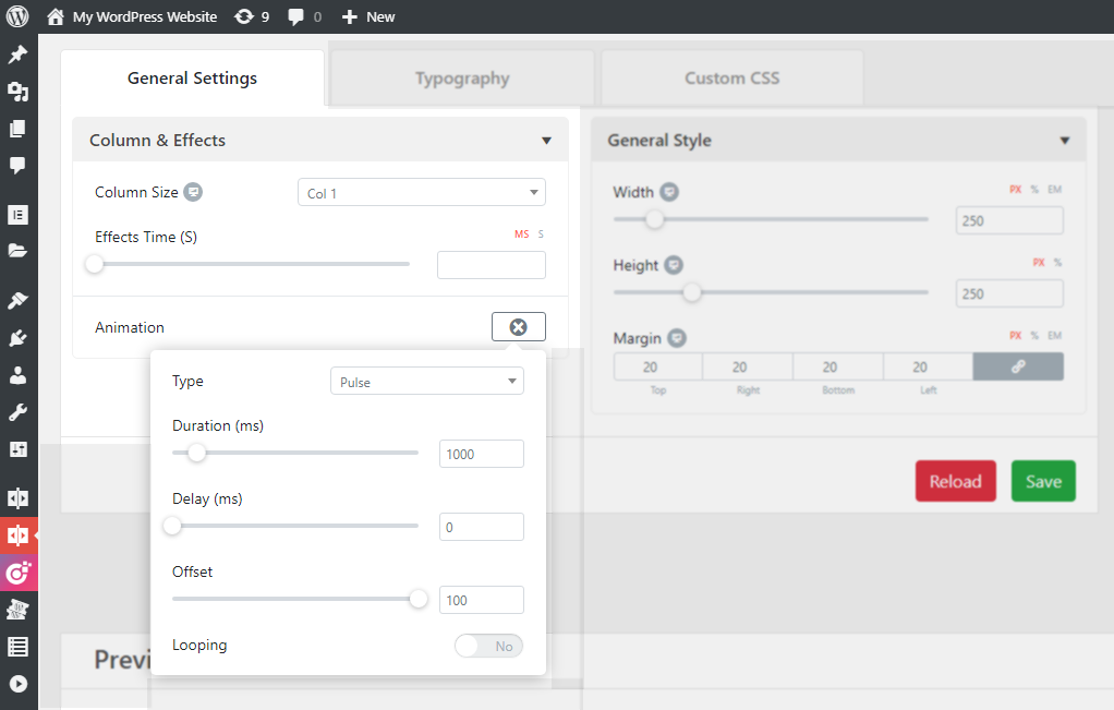
General Style
The General Style setting covers the measurement options. You can customize the width, height, and margin of the image hover for different dimensions.
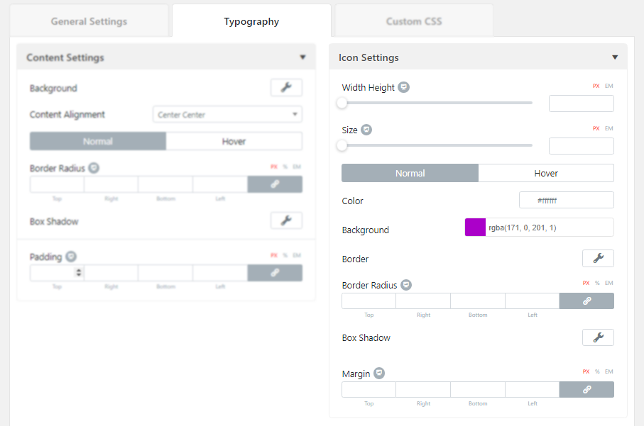
Typography
When you are done with the general settings, here you’ll find the “Typography” section along with 2 sub-sections to customize the styles of contents and icons. Now, let’s see how to edit this section:
Content Settings
Here in this settings area, you can customize the background color of the image hover content, set the alignment, and set the border-radius, box-shadow, and padding for both normal and hover mode.
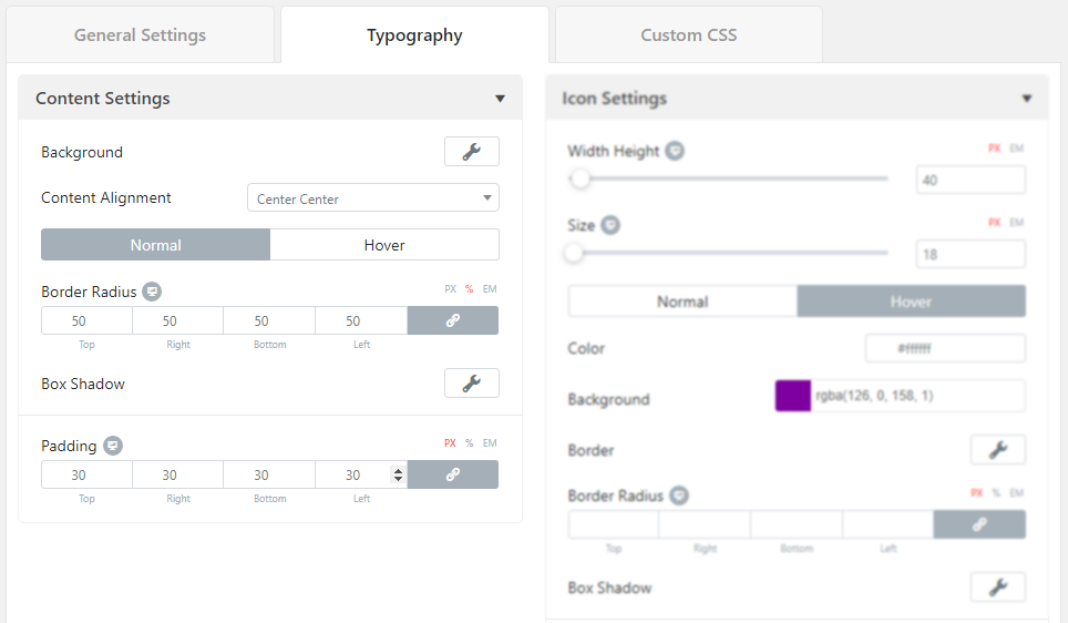
In the background setting, you can choose either you want a color background or an image as the background. And in the box-shadow setting, you can customize the setting elaborately for getting a better version of the style.
Icon Settings
The icon settings area is for customizing the width, height, and size of the icon. You can also customize the background color and the icon’s color of the image hover content, set the border style, width, and customize the border-radius, box-shadow, and margin of both normal and hover mode.
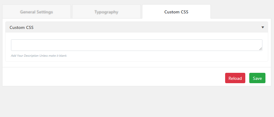
Custom CSS Option
Here you’ll find a box where you can add your custom CSS code. Advanced developers can use this option for their convenience. After entering the codes, developers can see the live preview. Once you finish coding hit the “Save” button to make your changes.